Design system | UI | Design opsA cohesive brand experience
After 3 years on market, an app in the works and a redesign and build of the Athena public site, it was important to establish a system that could be followed - for both design consistency and business efficiencies.
Following the work with Ed Studio to re-design our public site we set about building out our component library and design system to set the foundations for all our digital experiences.
Company
Athena Home Loans
My role
Design Director
Team
Athena
core brand refreshTypeface & colours for digital applications
Athena’s existing typeface and colours were not optimised for digital experiences, considering a brand and product that lives and breaths digital, this needed to change. Working with Ed Studio refreshed our colours, with consideration to accessibility and employed a digitally optimised google font, Inter.
ProblemAthena had no established design system or component library. Everything previously was hard coded and built at a page level.
This created huge inefficiencies for the business and contributed to broken patterns with no cohesive brand across our experiences.
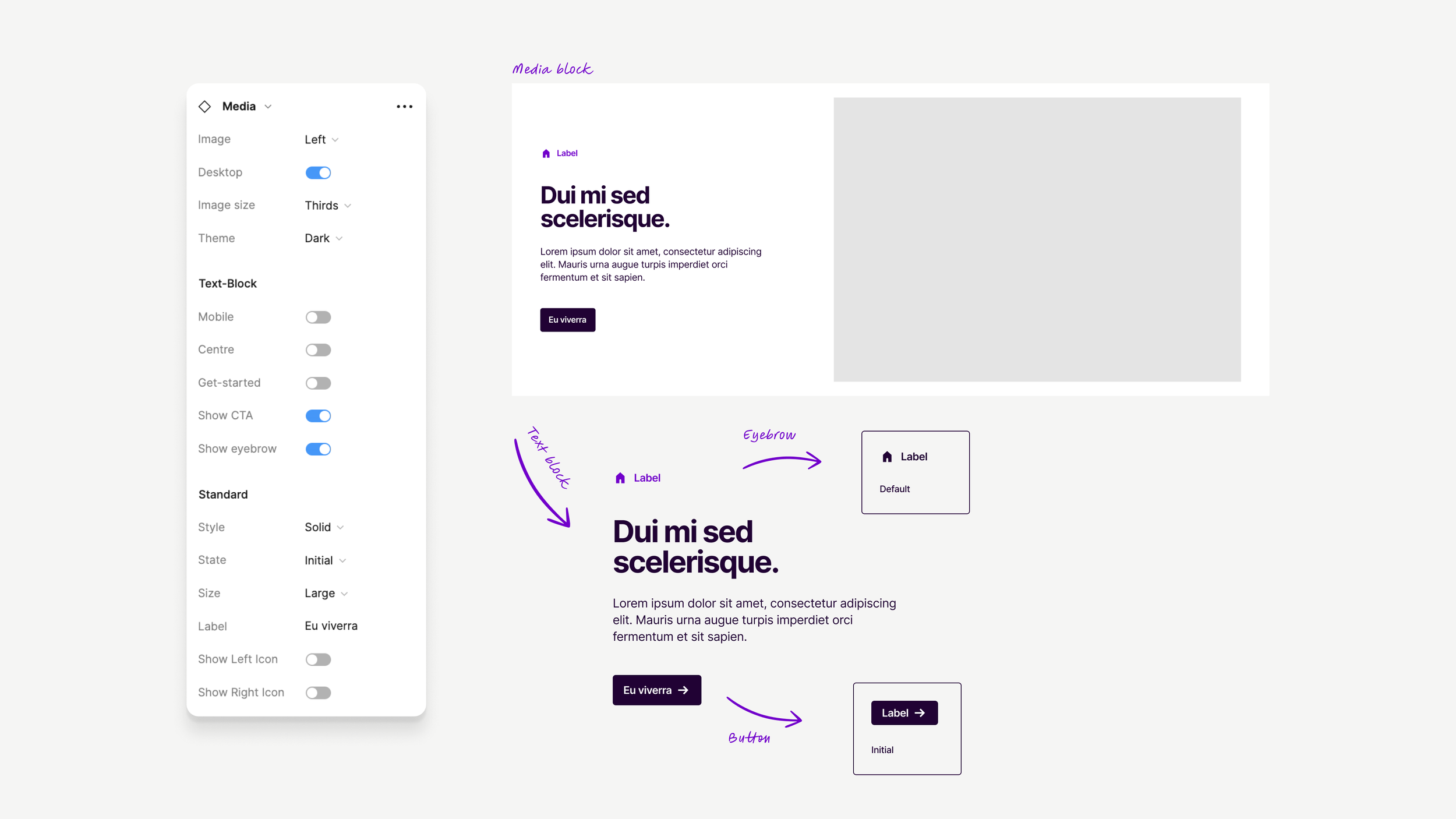
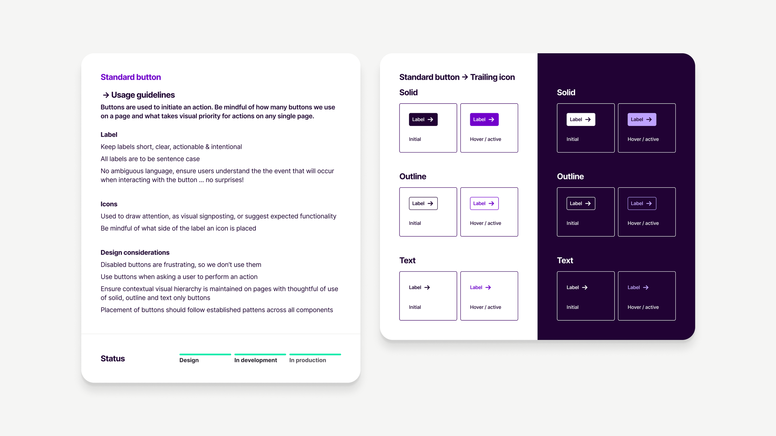
SolutionWe built a custom, reusable modular set of components that are all built and designed from the foundations of the Athena brand.
This library of components was built agnostically so that we could, in time, use the same components across multiple platforms allowing us to repeat patterns and designs established on the public site, in our native app and apply funnel, establishing a cohesive brand experience for our customers.
A system for our system
Our libraries are broken down in to three main categories, representing the building blocks of our components;
Tokens ⚡️
The core foundations to build our library
Elements ⚛️
The building blocks for our components
Components 🧩
The reusable compositions of the established UI
Library structure


